REVAMP PROJECT
REVAMP PROJECT
Starbucks App Redesign: Elevating the Coffee Experience
Starbucks App Redesign: Elevating the Coffee Experience
Brewing a bold new take on the Starbucks app! I revamped usability and streamlined users' coffee cravings. Because their coffee run should be as smooth as the latte foam.
Brewing a bold new take on the Starbucks app! I revamped usability and streamlined users' coffee cravings. Because their coffee run should be as smooth as the latte foam.
Product Design | UX Research
Product Design | UX Research
Duration
Duration
7 weeks
7 weeks
7 weeks
Responsibilities
Responsibilities
UX researcher🕵️♀️✍️
UI designer 🎨📱
UX designer💡📐
UX researcher🕵️♀️✍️
UI designer 🎨📱
UX designer💡📐
UX researcher🕵️♀️✍️
UI designer 🎨📱
UX designer💡📐
Tools
Tools

Figma
Figma
Figma


What’s Brewing?
What’s Brewing?
Welcome to the ultimate Starbucks app makeover! ✨ This project is all about brewing a seamless and delightful digital experience for Starbucks lovers. 🌟 Dive into the journey of redesigning the Starbucks app to make your coffee ordering as smooth as your favorite latte. 🥤📱
Welcome to the ultimate Starbucks app makeover! ✨ This project is all about brewing a seamless and delightful digital experience for Starbucks lovers. 🌟 Dive into the journey of redesigning the Starbucks app to make your coffee ordering as smooth as your favorite latte. 🥤📱
Design Impact
Design Impact
Task completion time improved from 2.5 minutes to 1.8 minutes.
Time required to make decisions like menu browsing, or customizing orders dropped by 28%
Task completion time improved from 2.5 minutes to 1.8 minutes.
Time required to make decisions like menu browsing, or customizing orders dropped by 28%
Revenue ripple
Revenue ripple
Implementing the redesign has the potential to create measurable business impacts(hypothetically speaking):
Implementing the redesign has the potential to create measurable business impacts(hypothetically speaking):
Order conversions are projected to jump from 12% to 18%, thanks to a menu layout so smooth it’s like your latte orders itself.
Customer retention could see a 15% boost, as the redesign makes completing tasks so effortless and reordering super easy—a true game-changer for coffee lovers everywhere!
Order conversions are projected to jump from 12% to 18%, thanks to a menu layout so smooth it’s like your latte orders itself.
Customer retention could see a 15% boost, as the redesign makes completing tasks so effortless and reordering super easy—a true game-changer for coffee lovers everywhere!
Overall, the redesign not only enhances the user experience but positions the business to capture and deepen customer engagement.
Overall, the redesign not only enhances the user experience but positions the business to capture and deepen customer engagement.
Ground Rules
Ground Rules
My redesign wasn’t just a random brew—it was brewed to perfection with a shot of UX magic. I take my UX laws as seriously as a coffee lover takes their morning cup, and I made sure to grind through the existing app, stirring in design changes wherever it lacked that extra flavor.
Before we dive deep into the project, let’s take a sip of the old vs. new designs. Trust me, you’ll want to stick around till the end of this page to savor the final results!
Old

New

Jacob's Law: We kept things comfy and familiar by sticking the profile button at the bottom-right corner (where your thumb naturally goes 🙌). No need to go on a scavenger hunt!
Old
New
Jacob's Law: We kept things comfy and familiar by sticking the profile button at the bottom-right corner (where your thumb naturally goes 🙌). No need to go on a scavenger hunt!
Hick's Law: We cut through the clutter with dropdown menus, making sure users don’t get caught in decision paralysis. Simplicity is key—less thinking, more clicking!
Old
New

Hick's Law: We cut through the clutter with dropdown menus, making sure users don’t get caught in decision paralysis. Simplicity is key—less thinking, more clicking!
Old
New
Old
New
Aesthetic Usability Effect: I made sure the app is easy on the eyes 👀, but not at the cost of functionality. It’s all about balancing !
Old
New
Aesthetic Usability Effect: I made sure the app is easy on the eyes 👀, but not at the cost of functionality. It’s all about balancing !
let’s brew up the main ingredients of this redesign!
let’s brew up the main ingredients of this redesign!
Bitter Beginnings
Bitter Beginnings
I dove into the minds of our users with 3 contextual inquiries and 4 interviews to uncover their thoughts and experiences. Here’s the tea (or coffee ☕) I brewed from it all!
I dove into the minds of our users with 3 contextual inquiries and 4 interviews to uncover their thoughts and experiences. Here’s the tea (or coffee ☕) I brewed from it all!
Menu Overload: People loved the drink pics, but the coffee lingo left new users feeling like they needed a translator. Finding drink details? That was another scavenger hunt.
Menu Overload: People loved the drink pics, but the coffee lingo left new users feeling like they needed a translator. Finding drink details? That was another scavenger hunt.
Customization Overload: Too many options, too little clarity. Also, real-time price updates during customization… Major wishlist item.
Customization Overload: Too many options, too little clarity. Also, real-time price updates during customization… Major wishlist item.
The Price is... Hidden: Users didn’t want to wait until checkout to see prices. Show them the money (sooner)!
The Price is... Hidden: Users didn’t want to wait until checkout to see prices. Show them the money (sooner)!
Reordering Woes: Favorites weren’t so favorite when reordering the same drink turned into a hassle.
Reordering Woes: Favorites weren’t so favorite when reordering the same drink turned into a hassle.
Pretty but Puzzling: Users loved the app’s sleek design, but seasoned pros had a way easier time navigating it than the rookies.
Pretty but Puzzling: Users loved the app’s sleek design, but seasoned pros had a way easier time navigating it than the rookies.
In short, the app looks great but could use some caffeine for its usability!
In short, the app looks great but could use some caffeine for its usability!
Coffee Drinkers
Coffee Drinkers
To create a Starbucks app experience that truly resonates, I dug deep into the world of our users, crafting personas that capture the essence of their needs and challenges. Meet our two main characters: 👇
To create a Starbucks app experience that truly resonates, I dug deep into the world of our users, crafting personas that capture the essence of their needs and challenges. Meet our two main characters: 👇


Recommended Improvements
Recommended
Improvements
Based on our user personas and insights from research, here are the recommended improvements to enhance the Starbucks app experience:
Based on our user personas and insights from research, here are the recommended improvements to enhance the Starbucks app experience:
Enhance Homepage Layout: Bring important features like favourites and previous orders right to the home screen for easy access.
Enhance Homepage Layout: Bring important features like favourites and previous orders right to the home screen for easy access.
Menu First Approach: Let users jump straight into the menu options after tapping the order button, instead of the location selection page.
Menu First Approach: Let users jump straight into the menu options after tapping the order button, instead of the location selection page.
Coffee Glossary: Add a guide for coffee terms to help new users make informed choices and feel confident with their orders!
Coffee Glossary: Add a guide for coffee terms to help new users make informed choices and feel confident with their orders!
Improve Drink Information: Make sure drink descriptions and ingredients are easy to find, so users know exactly what they're ordering.
Improve Drink Information: Make sure drink descriptions and ingredients are easy to find, so users know exactly what they're ordering.
Simplify Customization: Start with basic options and expand for those seeking detailed modifications.
Simplify Customization: Start with basic options and expand for those seeking detailed modifications.
Real-Time Pricing Updates: Show price changes dynamically as users customize their drinks to ensure full transparency.
Real-Time Pricing Updates: Show price changes dynamically as users customize their drinks to ensure full transparency.
Display Pricing Earlier: Show base prices right on the menu selection page, so users can make decisions without needing to go all the way to checkout to see the final pricing.
Display Pricing Earlier: Show base prices right on the menu selection page, so users can make decisions without needing to go all the way to checkout to see the final pricing.
Enhance Reordering Experience: Allow users to reorder their favourite drinks at the same location with just one tap—easy peasy!
Enhance Reordering Experience: Allow users to reorder their favourite drinks at the same location with just one tap—easy peasy!
The Rough Roast
The Rough Roast
I came up with some sketches where I made sure to brainstorm all the changes and iron out the details before diving into wireframing!
I came up with some sketches where I made sure to brainstorm all the changes and iron out the details before diving into wireframing!


The First Brew
The First Brew
I brewed up some ideas for low-fi prototypes, inspired by the recommended improvements—because great app design deserves a perfect blend too!
I brewed up some ideas for low-fi prototypes, inspired by the recommended improvements—because great app design deserves a perfect blend too!


Rich & Refined
Rich & Refined
After brewing up some feedback from my low-fidelity prototype, which I tested with both loyal Starbucks fans and a few new coffee enthusiasts, I took the results and stewed them into high-fidelity prototypes
After brewing up some feedback from my low-fidelity prototype, which I tested with both loyal Starbucks fans and a few new coffee enthusiasts, I took the results and stewed them into high-fidelity prototypes


While testing my lo-fi prototype with some fellow coffee enthusiasts, one user mentioned they wished there was a dedicated section to explore all the different types of coffee. That way, they could easily learn about the options before deciding which delicious brew to order.
This feedback sparked the idea for the final screen in my hi-fi prototype. I’ll dive into how I turned this simple yet brilliant suggestion into an easier way to order coffee. Stay tuned! ✨
Bean Tweaks
Bean Tweaks
In this section, I’ll be brewing up the details of all the changes I’ve made to the app—sip by sip ☕. I’ll also pour in my reasons behind each decision because, let’s be honest, every good redesign needs a strong shot of justification. Most of these changes were carefully crafted based on contextual inquiries and interviews—like baristas perfecting a recipe based on customer feedback.
Now, while this might not be the perfect cup of redesign, I’ve given it my best roast with the inputs and insights I had.
Home page
Home Page
Old
Old

New
New

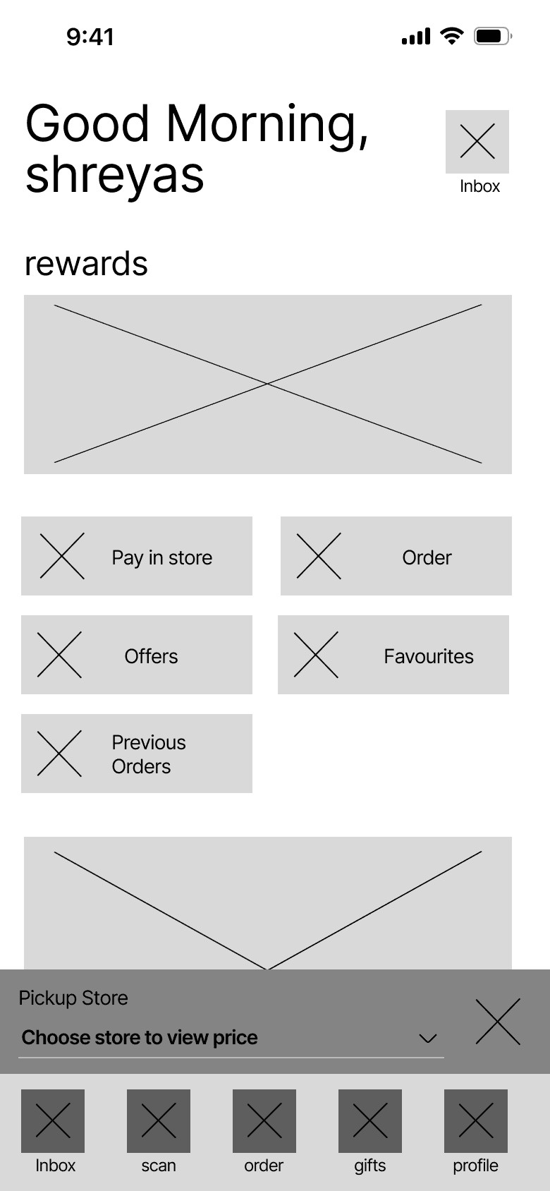
I gave the top section of the app a little makeover—moved the inbox, stores, history, and profile buttons around. The profile button now chills at the bottom-right corner because, well, Jacob’s Law says so. 👨⚖️
I gave the top section of the app a little makeover—moved the inbox, stores, history, and profile buttons around. The profile button now chills at the bottom-right corner because, well, Jacob’s Law says so. 👨⚖️
The rewards section is now crystal clear and designed with a sprinkle of aesthetic magic for maximum usability.
The rewards section is now crystal clear and designed with a sprinkle of aesthetic magic for maximum usability.
Old
Old
New
New

Old
Old

New
New

Key buttons like Pay In-Store, Offers (relocated from the bottom-right corner), Favorites, and Previous Orders (a.k.a. History) have been centered for smoother navigation. The Order button was removed because, let’s be real, showing it twice on the same screen was a bit overkill (it’s already chillin’ in the nav bar).
Bonus 🎉: I’ve added an extra button of Know your Coffee based on their feedback, because why stop at good when you can be great?"
Product Page
Product Page
Old
Old

New
New
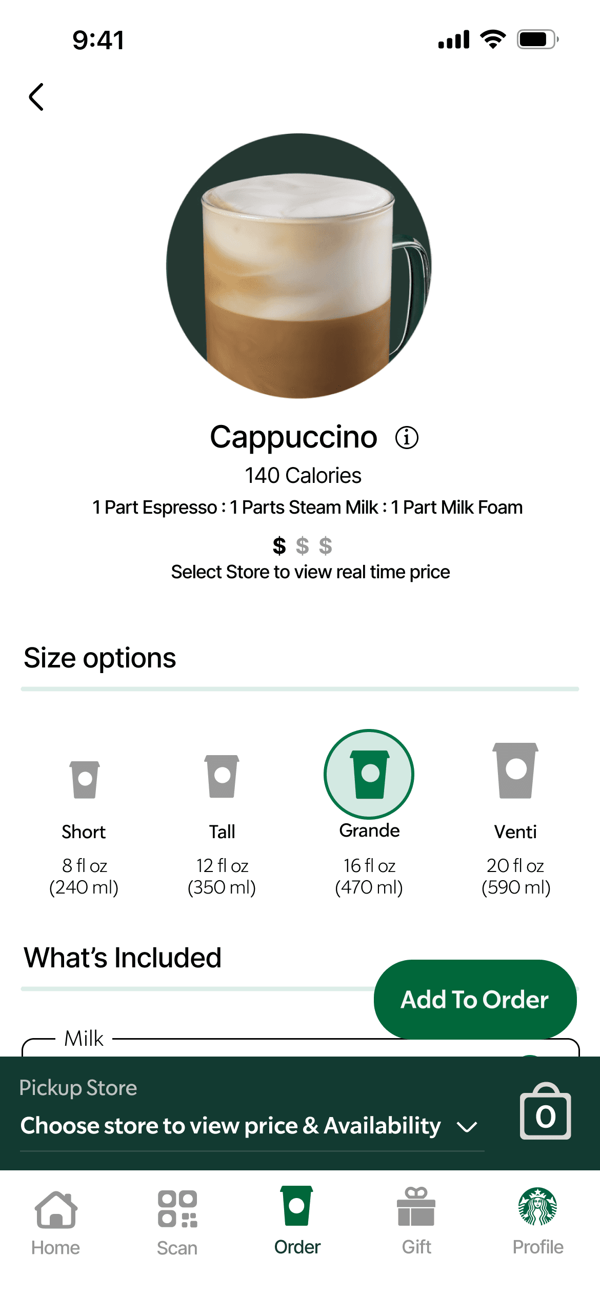

On this product ordering page, I've imagined two scenarios: if the user hasn't picked a location yet, the price won't be fully shown (but the price range will be!) 🧐. Once the user selects a location, voilà!—the real-time price pops up.
Also, in the original Starbucks page, drinks are a bit of a mystery, with no descriptions. But in my redesign, I've added a neat little breakdown of what’s in each coffee, right below the product image✨. No more guessing what's inside your cup!
Based on my persona, Clark Morgan 🇬🇧, a UK traveler who got totally lost between oz and ml while touring the US 🇺🇸, this design decision is here to help users like him!
Now, those who are more comfortable with ml can easily see size options in their preferred format. It's all about universal usability 🌍—making things simpler for everyone, no matter where they’re from!
Old
Old

New
New


Now, based on your customizations, you’ll see real-time price updates—something the original Starbucks app forgot to do! 😅
Now, based on your customizations, you’ll see real-time price updates—something the original Starbucks app forgot to do! 😅
Previous Orders
Previous Orders
Old
Old

New
New
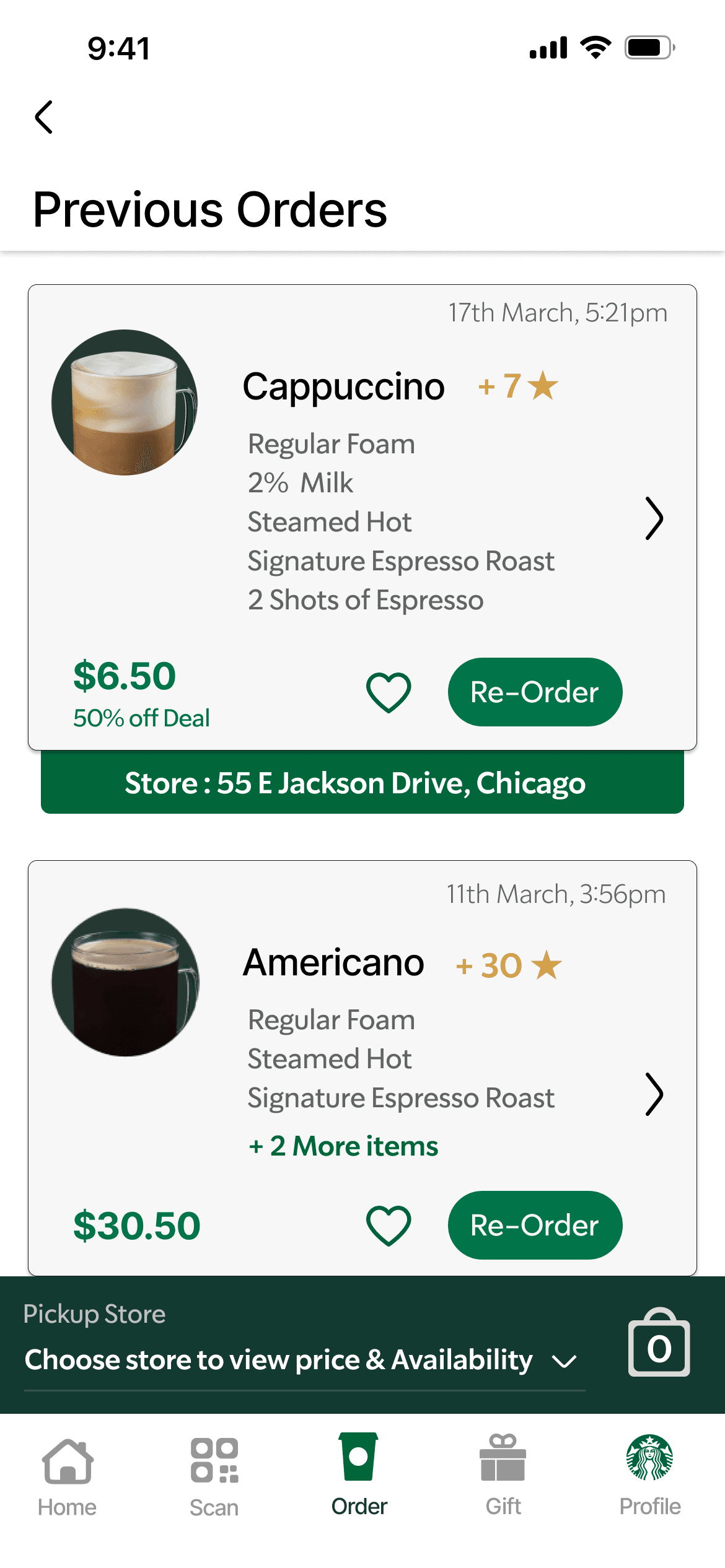
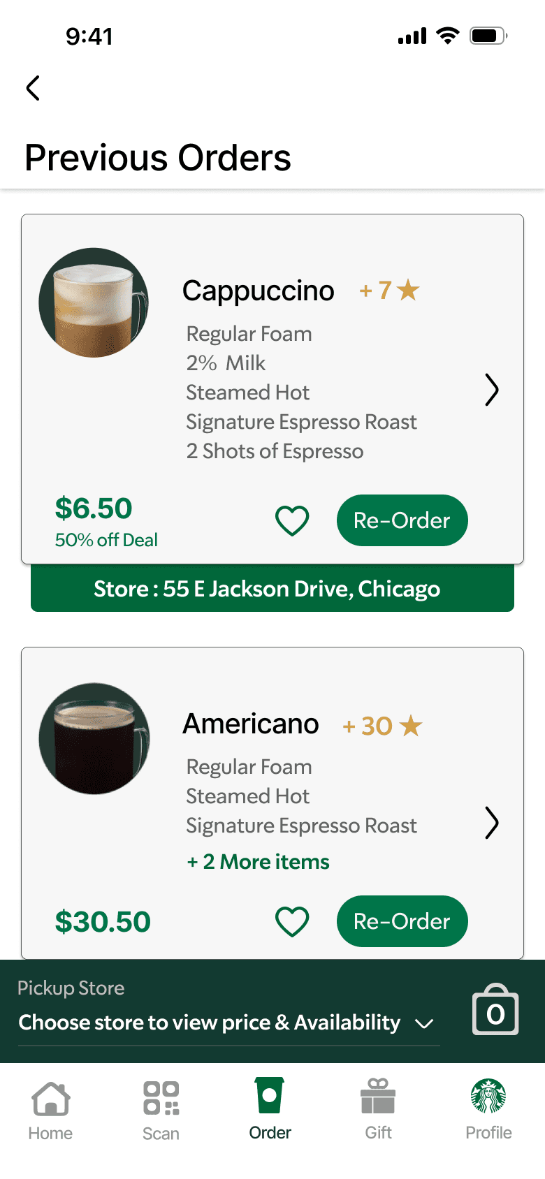
The old order history page was a real head-scratcher for users, and there wasn’t even a reorder button! In the redesign, I cleaned up the mess 🧹 and added a sleek reorder button that perfectly matches Starbucks' signature aesthetic and simple vibe. Now, it’s easy peasy to revisit the faves!
The old order history page was a real head-scratcher for users, and there wasn’t even a reorder button! In the redesign, I cleaned up the mess 🧹 and added a sleek reorder button that perfectly matches Starbucks' signature aesthetic and simple vibe. Now, it’s easy peasy to revisit the faves!
Know Your Coffee
Know Your Coffee
The "Know Your Coffee" page is inspired by our awesome user interviews 🎤. Here, you'll discover all the different coffee types and their magical compositions—perfect for helping you figure out exactly what you want to order! And with a handy button right below each description, you can jump straight to the coffee section and place your order in a snap. 🚀
The "Know Your Coffee" page is inspired by our awesome user interviews 🎤. Here, you'll discover all the different coffee types and their magical compositions—perfect for helping you figure out exactly what you want to order! And with a handy button right below each description, you can jump straight to the coffee section and place your order in a snap. 🚀

That’s a Wrap(puccino)
That’s a Wrap(puccino)
This redesign transformed the Starbucks app into a smoother, more intuitive experience, ensuring users can easily find what they need—from favorite drinks to essential info. The streamlined navigation and personalized features make ordering coffee a breeze, just like enjoying that first perfect sip of morning coffee 🌞!
This redesign transformed the Starbucks app into a smoother, more intuitive experience, ensuring users can easily find what they need—from favorite drinks to essential info. The streamlined navigation and personalized features make ordering coffee a breeze, just like enjoying that first perfect sip of morning coffee 🌞!
Beans of Wisdom
Beans of Wisdom
I discovered that simplicity is key! Sometimes, it’s not about adding more but about making things easier. Also, user feedback is the secret ingredient to making any app shine. 🌟 This project taught me to listen, learn, and brew the perfect user experience!
I discovered that simplicity is key! Sometimes, it’s not about adding more but about making things easier. Also, user feedback is the secret ingredient to making any app shine. 🌟 This project taught me to listen, learn, and brew the perfect user experience!

Here’s to smoother sips and even smoother clicks – your next coffee break just got an upgrade! ☕🚀
Here’s to smoother sips and even smoother clicks – your next coffee break just got an upgrade! ☕🚀

What Else I've Done
What Else I've Done
SMART HOME APPLICATION
SMART HOME APPLICATION
Sentri : Effortless Control, Uncompromised Security
Sentri : Effortless Control, Uncompromised Security
Simplifying home automation with user-centered design and enhancing convenience with a research-driven approach to smart living.
Simplifying home automation with user-centered design and enhancing convenience with a research-driven approach to smart living.
RESEARCH CASE STUDY
Culture-Based UI Design for Indian Regions
Culture-Based UI Design for Indian Regions
A study on integrating regional cultural elements like colors, motifs, and traditions into user interface design to create meaningful, localized digital experiences.
A study on integrating regional cultural elements like colors, motifs, and traditions into user interface design to create meaningful, localized digital experiences.
UX Research

Officially the end of the page 📜.
Unofficially the start of our collaboration? 🤝✨
Dreamed in daylight 🌅, built in the quiet of the night 🌙
Officially the end of the page .
Unofficially the start of our collaboration? 🤝
Built from the ground up.
No templates were harmed in the making of this site.